
Autumn coloring journal
Cute Fall Coloring Ideas for Adults: 12 Cozy Ways to Use Autumn Color
The most convincing fall pages do more than turn every object orange. Pick a kind of autumn light first, repeat a small family of colors, and let texture carry the cozy feeling.
01
Choose the kind of fall day before choosing markers
A bright apple-picking afternoon, a rainy reading nook and a candlelit October evening all belong to fall, but they need different color decisions. Before coloring, name the weather and time of day in one short phrase. That phrase becomes the rule for the page.
For a sunny scene, keep the background light and let rust, mustard and leaf green provide the contrast. For rain, mute the outdoor colors and reserve the warmest shades for windows, mugs and lamps. For evening, build the page around one warm light source and a cooler surrounding color.
02
12 fall ideas that make a page feel intentional
Use these as starting points rather than rules. One clear idea repeated across the scene usually feels more polished than giving every object a different special effect.
Golden-hour windows
Color window light with pale cream at the center, honey around it and a soft peach edge. Keep the room slightly cooler so the window actually glows.
A leaf gradient
Move from green to yellow, orange and rust across a pile of leaves instead of coloring each leaf randomly.
Rainy-day contrast
Use blue-gray and muted teal outdoors, then repeat pumpkin, caramel and warm pink on the characters inside.
Patchwork blankets
Limit a blanket to three repeating colors and alternate simple checks, dots and stripes.
Apple-orchard color story
Pair deep red apples with olive leaves, straw baskets and a pale sky so the fruit remains the focus.
Pumpkins with personality
Mix cream, sage and terracotta pumpkins, then use one darker brown for every stem and cast shadow.
Cinnamon bakery
Build pastries from cream, biscuit, caramel and cocoa; add berry red only to jam or packaging.
Foggy morning
Lower the contrast in distant objects and save darker outlines or pencils for the foreground character.
Cozy knit texture
Add tiny V shapes, ribs or alternating bands with pencil after the marker layer is dry.
Bookshop afternoon
Repeat burgundy, forest green and ochre on book spines, but leave shelves and walls quiet.
Woodland walk
Use mushrooms and scarves as small bright accents against moss, bark and muted leaves.
First chilly night
Let the sky be deep blue rather than black and reflect a little warm window color onto the nearest path or character.
03
Where to place the darkest color
Choose one dark neutral for the entire page: espresso, deep plum, forest or navy. Use it under furniture, behind overlapping objects and on the side facing away from the main light. Repeating the same shadow color makes unrelated objects feel like they share one atmosphere.
Do not outline every colored area with the darkest marker. A few strategic dark shapes around the focal point create more depth and keep the page soft enough for a cozy style.
Palette cards
Colors to try on the page
Pumpkin Bakery
warm, sweet and softly nostalgic
Try it on kitchens, pastries, market stalls and characters carrying warm drinks.
Rain on the Window
quiet, cool outside and warm inside
Keep the blues near windows and use the two warm accents only in the protected indoor space.
Woodland Picnic
earthy with one playful pop
Use berry on one scarf, bag or picnic detail; let the earth tones fill the larger areas.
Soft October
light, cute and not traditionally orange
A good choice for bedrooms, cafés and gentle character scenes where bright orange would feel too loud.
Color the full collection
Books that fit this journal
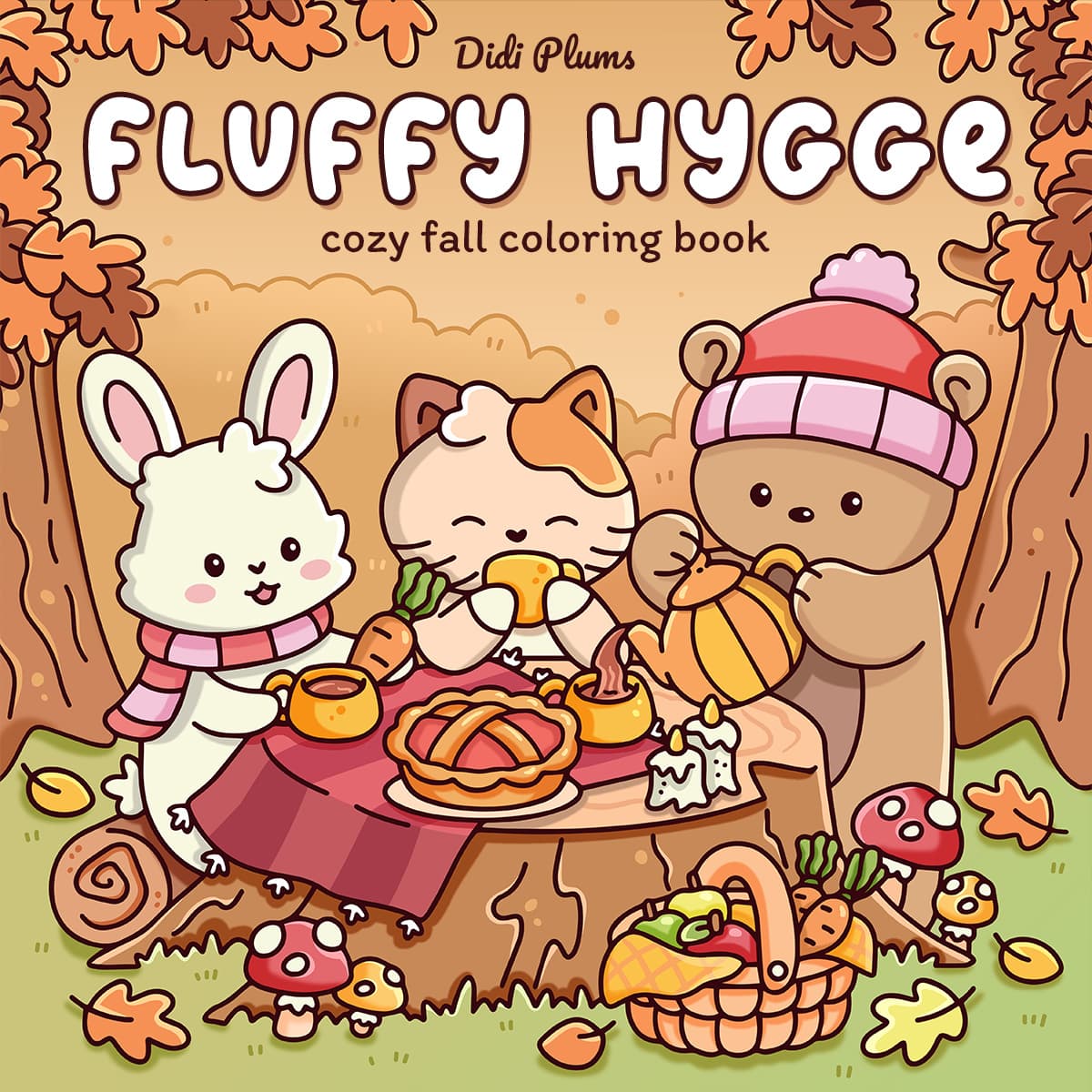
The ideas above work independently. If you want complete scenes ready to color, these digital editions are the closest match.
Questions from the coloring table
Which colors make a coloring page feel like fall?
Rust, ochre, olive, burgundy and warm brown create an immediate autumn signal, but the page feels richer when they are balanced with cream, muted blue, soft pink or plum.
How many colors should I use on a cozy fall page?
Start with five main colors plus one dark neutral. You can create lighter versions by leaving white space or using a paler marker, and darker versions with pencil or a related shadow shade.
How can I avoid making every fall page look orange?
Choose a different supporting mood: rainy teal, dusty mauve, woodland green or night blue. Keep orange as a small seasonal accent rather than the base of every object.
Keep exploring