
Palette notebook
Cozy Autumn Color Palettes: 8 Combinations Beyond Pumpkin Orange
Autumn color does not have to mean five versions of orange. These eight combinations give each page a distinct atmosphere while keeping enough warmth to feel seasonal.
01
A simple ratio for using any palette
Give roughly half of the page to two quiet colors, about a third to the supporting middle colors, and reserve the brightest or darkest shade for focal details. The exact percentage is not important; the hierarchy is.
Repeat each important color at least twice in separate parts of the page. A scarf can echo a book spine, a mug can echo a flowerpot, and a window frame can echo a character's shoes. Repetition makes the palette feel chosen rather than accidental.
02
Translate screen colors into the markers you own
Treat the swatches below as relationships, not mandatory product codes. Look for one pale base, two middle colors, one warm or playful accent and one shade deep enough to anchor the scene.
Test the candidates together on scrap paper. If two middle colors look almost identical, replace one with a lighter or cooler option so every swatch has a job.
Palette cards
Colors to try on the page
Pumpkin Bakery
pastries and warm kitchens
Let cream cover the largest surfaces and keep cranberry for labels, berries and tiny accessories.
Rainy Bookshop
cool windows and warm shelves
Use the three cool colors outside or in shadow, then bring old paper and merlot into the shop.
Soft October
gentle, cute and modern
Ideal for bedrooms, cafés and self-care scenes that need autumn without obvious holiday color.
Apple Orchard
fresh air and crisp fruit
Repeat apple red sparingly; the green, straw and bark should make up most of the scene.
Mushroom Walk
earthy woodland treasure hunt
Use aubergine beneath caps, coats and overlapping objects as a softer alternative to black.
Blue Hour Bonfire
the first cold evening
Keep the warm colors closest to the fire and repeat small traces of them on faces and nearby objects.
Harvest Market
busy, cheerful and rustic
Use canvas on awnings and bags so the produce colors remain easy to read.
Candlelit Cocoa
quiet evening indoors
Place vanilla at the center of the light, candle around it and night plum at the outer edge of the room.
Color the full collection
Books that fit this journal
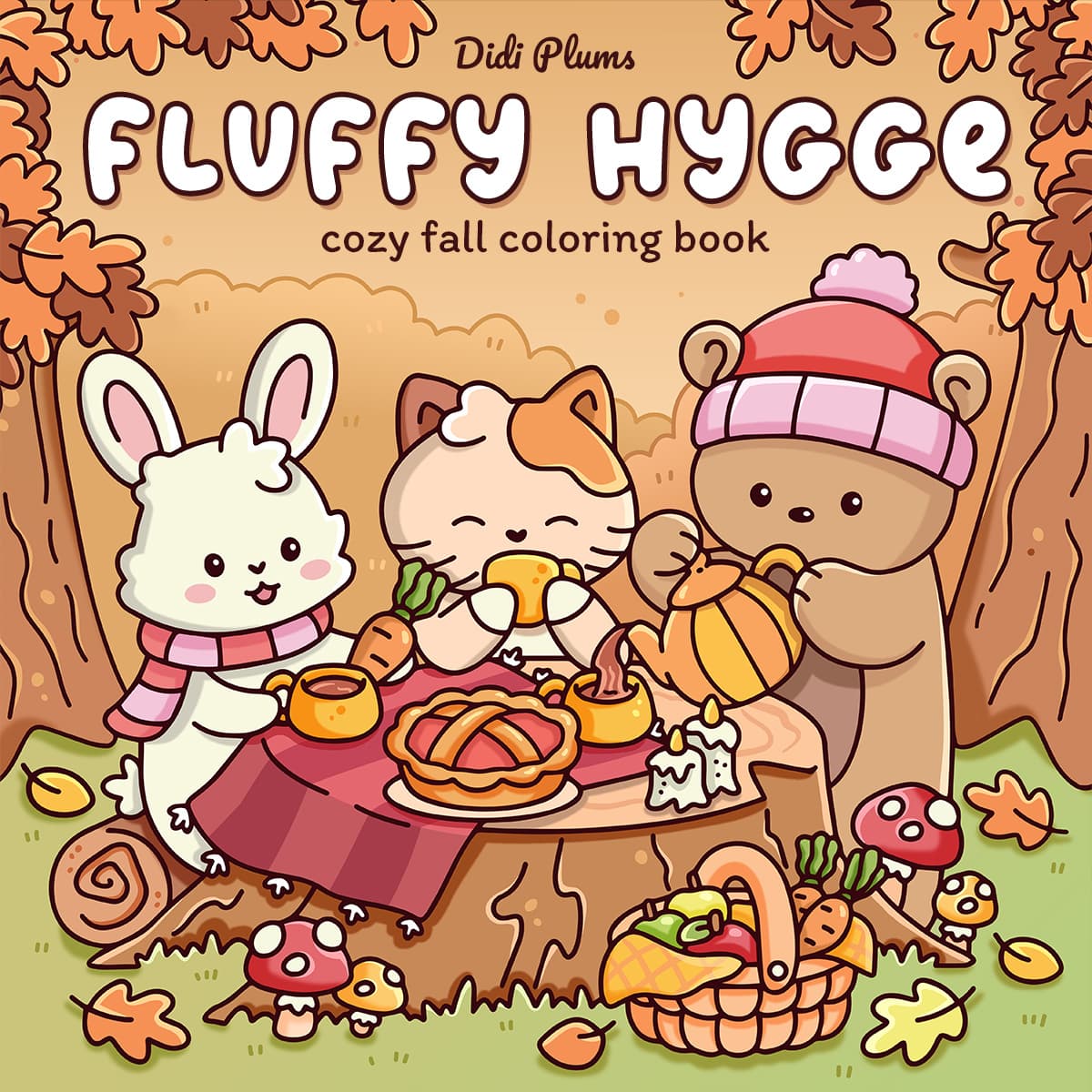
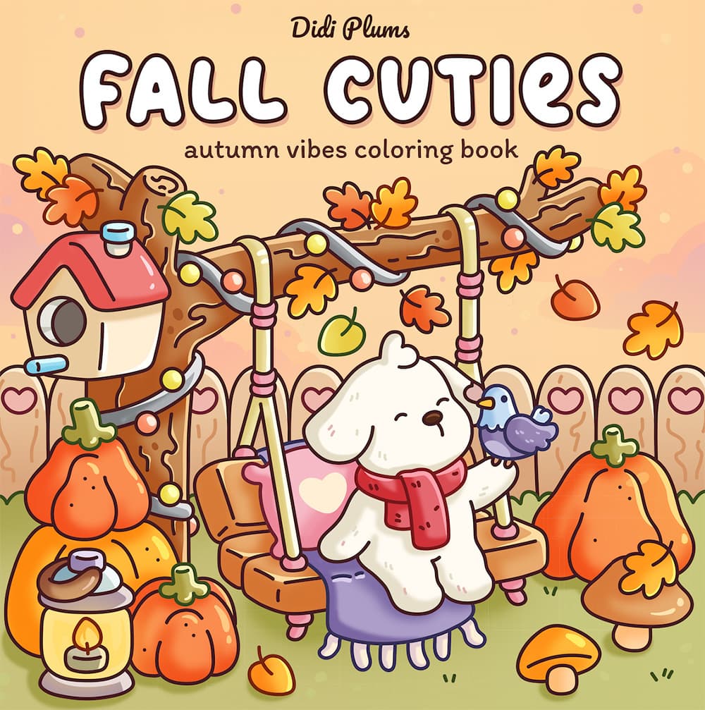
The ideas above work independently. If you want complete scenes ready to color, these digital editions are the closest match.
Questions from the coloring table
Do I need the exact marker colors shown?
No. Match the lightness and relationship between colors first. A pale neutral, two middle shades, an accent and a dark anchor matter more than matching an exact hex value.
Can I combine two autumn palettes?
Yes, but choose one as the base and borrow only one or two colors from the second. Combining all ten colors usually removes the clear mood that made each palette useful.
Which palette works best for a rainy fall scene?
Rainy Bookshop gives you cool fog, rain and teal for the weather plus old paper and merlot for a warm interior contrast.
Keep exploring